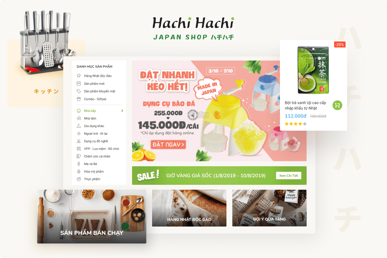
E-commerce Japan Shop

CLIENT
Hachi Hachi
LOCATION
HCMC, Vietnam
TIMELINE
2018
PLATFORM
Web Responsive
In 2018, Hachi Hachi was a small scale business in the convenience-store market. They was providing their customers an ecommerce platform which was quite outdated in UI, and also painful to interact with.
The revamp goal was to build a smooth online shopping experience for their niche customers, meanwhile aligning with their new branding personalitites.
My Contribution
▫️ UX Research
▫️ UI Design - Styles & Components
▫️ Interaction Design
▫️ Prototyping
▫️ Information Hierarchy
▫️ Userflow & Userstory
Research
For this project, the research outcomes benefit a lot for post-steps. We spent a week interviewing target users, deconstructing the current design, and auditing some big names in e-commerce.
Information Structure
Overall the site is divided into 3 parts: E-commerce, Buyer Function, and Blog. Each part has its own navigation and information structure, therefore a clear sitemap to show how things connected are crucial.
This help to:
- Show stakeholders the affected areas.
- Aware of the design (and development) scope.
- See how things are connected and structured.
Interaction & Visual Design

In e-commerce, there're some huge players in the market such as Tiki, Shopee, Lazada, ... and Hachi Hachi, at that moment, was a tiny one.
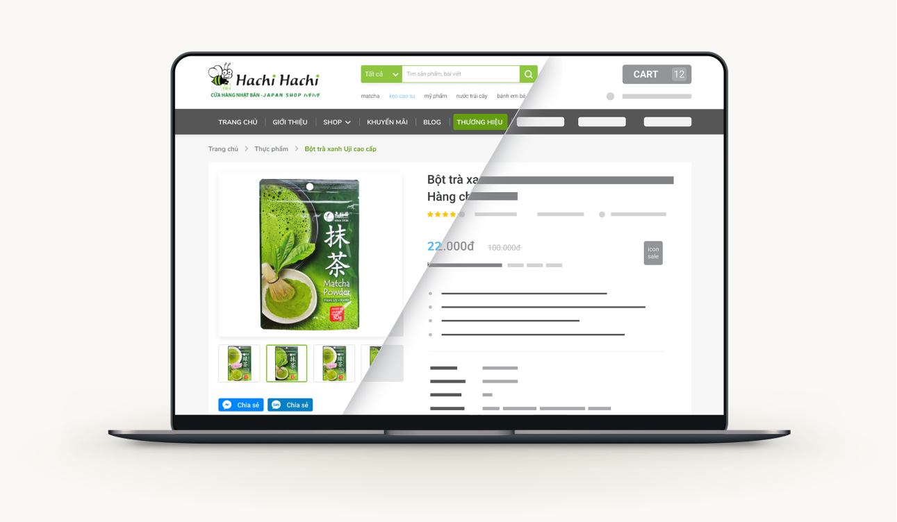
When it comes to visual design, designers had a dissension with the stakeholders. Hachi team is eager to make their site a unique look. But we persuaded them to take advantage of the existing UX, which mean re-use the patterns created by the top products, in order to reduce the learning curves.
The revamp also needed some tones of Hachi Hachi, therefore we had a look on user feedback, took some reference and ideas to add in visuals. And the outcome was the sweetspot in between, we did:
▫️ Resolve painpoints of visual feedback.
▫️ Provide users a clear status of the system.
▫️ Take advantage of other e-commerce conventions.
Design for Scale-up and Maintainability
In this project, we delivered the final designs, along with style guides and re-usable components. This help to maintain the consistency both from Design and Front-end teams. When the in-house team from Hachi Hachi takes over our works, they can continue on future pages or features without breaking the consistency.
We followed the atomic design principles, building things up from very basic elements, and keep reusing them for bigger components, pages. This way provided cross-disciplined teams some huge benefits:
- Easier to scale-up the product.
- Maintainability will not be a painful work.
- Save effort for Design and Development teams.

Outcomes
Insight from user research benefit for multiple teams
Never missed any design checkpoint with stakeholders
Seamless handover to the engineering team
Fruitful consulting and training for in-house designers
Foundation styles and components for further extend


