
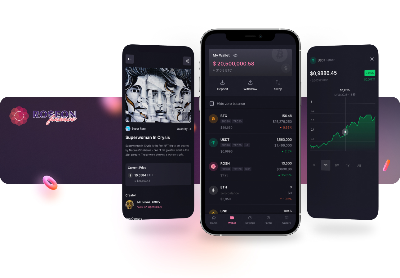
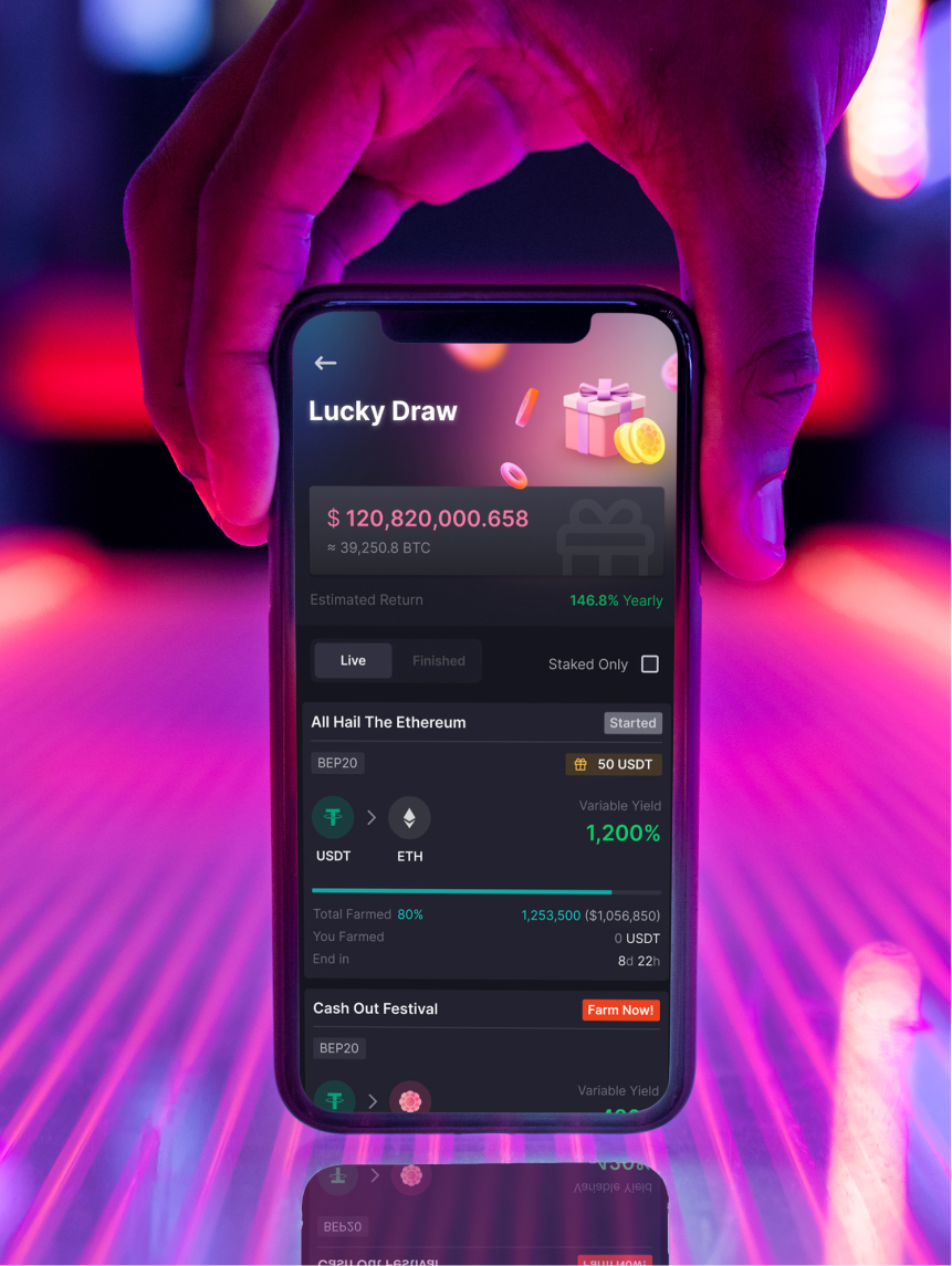
One-stop crypto experience
CLIENT
Roseon
LOCATION
Singapore
TIMELINE
2021
PLATFORM
Android & iOS app
Roseon Finance is a Mobile Multi-chain Yield Aggregator that tightly integrated with CeFi and DeFi services within the app to help simplify the digital asset investing experience.
Roseon awared that their current designs cannot scale-up with the upcoming roadmap. They asked our help as external Product Designers to form up the UX and Visual foundation for the product.
We worked with them in a 3-month project. Covered on researching, concept developing, and product designing.
My Contribution
▫️ Stakeholder Management
▫️ User Research & Competitor Research
▫️ Design Audit & Heuristic Evaluation
▫️ Userflow & Userstory
▫️ Concept Development
▫️ UI Design - Styles & Components
▫️ Interaction Design
▫️ Prototyping
The Design Process

Kick-off with a client interview
We start the project with a client interview on every aspect of the product. We dived deep into the active user surveys that the marketing team had accumulated. We were able to speak to Allan Ta - the founder, and Tri Do - the COO, in order to fulfill our checklist of market insights, domain knowledge and revamp expectations.
We agreed scope of works, timeline, and deliveries for the coming months.

Understanding the users
The internal marketing team did provide some insights, but to us it’s not fully targeted the data that need for redesign the experience on app. Therefore, we roll out some surveys, conduct some interview sessions in order to make clear: who are our users, what are the competitors, and how is the market fit of the current app.


Revealing what our users look like
We ran through a meeting with client and stakeholders to share them the research reports and findings. We're all agreed on the validation we had as it come outright from the facts.
Assumption from client
⛔️ Most app users are female.
⛔️ They're young adults or adolescent.
⛔️ The current design is not trendy for target users.
⛔️ They want more new features.
Validation from researches
✅ Most app users are male.
✅ Most of them are 25-44 years old (71%)
✅ Credibility and yield rate are what they care about.
✅ They want the current features to be optimal.


UX Audit on the current app
We have flagged some of the issues that are present in the current UI by using heuristic evaluation.
Most of the issues are found repeatedly throughout the product, increasing cognitive load and creating inconsistency everywhere.

Design Inception Worksheet to form-up the visual language
Languages are made up of differenct types of words that can be assembled together to create a message. Visual language is like any other language. The words of visual language can be grouped into colour, space, shape, typo and movement. And they’re all come from the reason Why users come to this product, the Moods they look for when experience the app.

The concept properties
All of this form up a concept that reflects users’ expectation on the look, the feel, and the experience of the product:
▫️ Mordern with a bit youthful graphics.
▫️ Soft and playful UI styles.
▫️ Geometric layouts and shapes.
▫️ Simple interactions and clear information.
▫️ Low learning curves for wide range of user levels.


"I'm impressed with the researches that engaged to users, the concept explaination, and the visual suggestion. From why we need to do things to how we do it. It's the same way of how I present to my investors. You convinced me."

Final Deliveries


Some positive feedback from beta version

Outcomes
Research reports & Final designs delivered in 8 weeks
Seamless handover to the engineering team
Foundation styles and components for long term updates
Training internal designers for scaling-up and maintaining the product
Researches that giving helpful insights for other teams