Haravan design system for scalability
TIMELINE
2022 - 2023
PLATFORM
Webapp, Mobile app
MY ROLE
Product Design
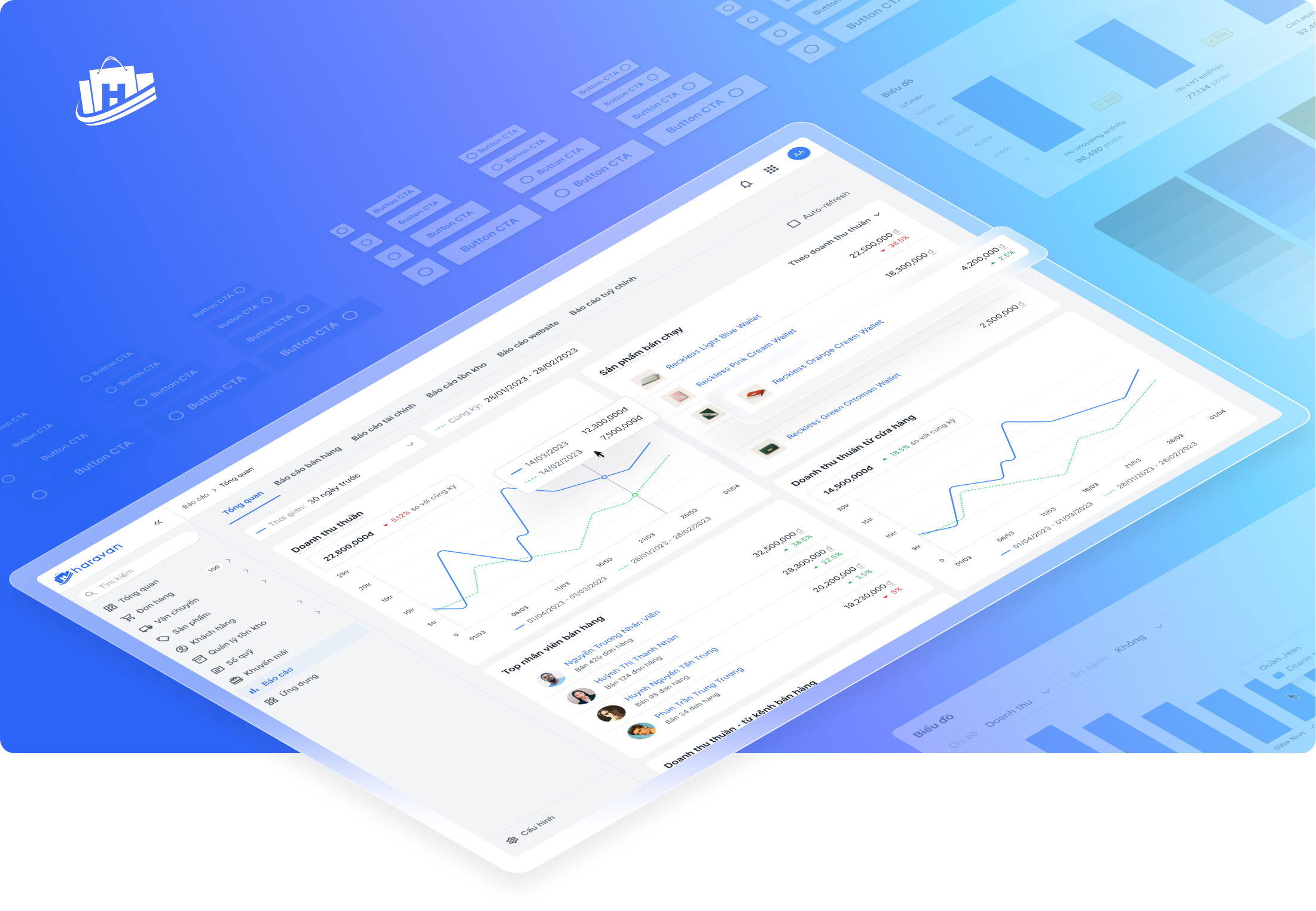
Haravan is a web app platform that enables its sellers to experience omnichannel sales and seamlessly manage their business operations.
To provide a cohesive and consistent user experience, Haravan's product team has built a comprehensive Design System (DS) that solves UX problems, eases maintenance, and ensures scalability. I'm responsible for design updates and refinements.
Product builders problems
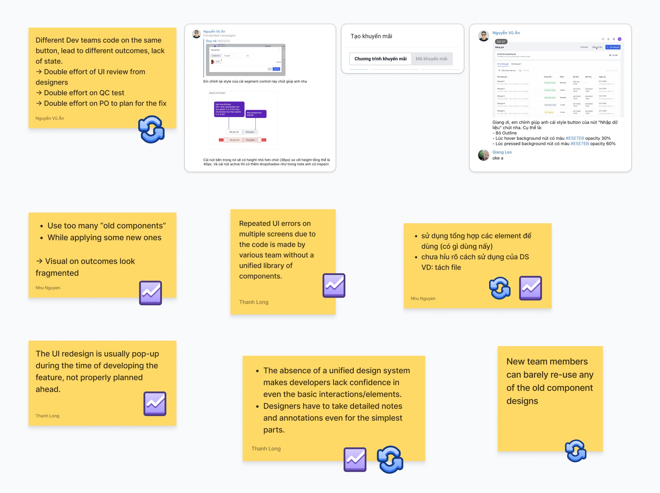
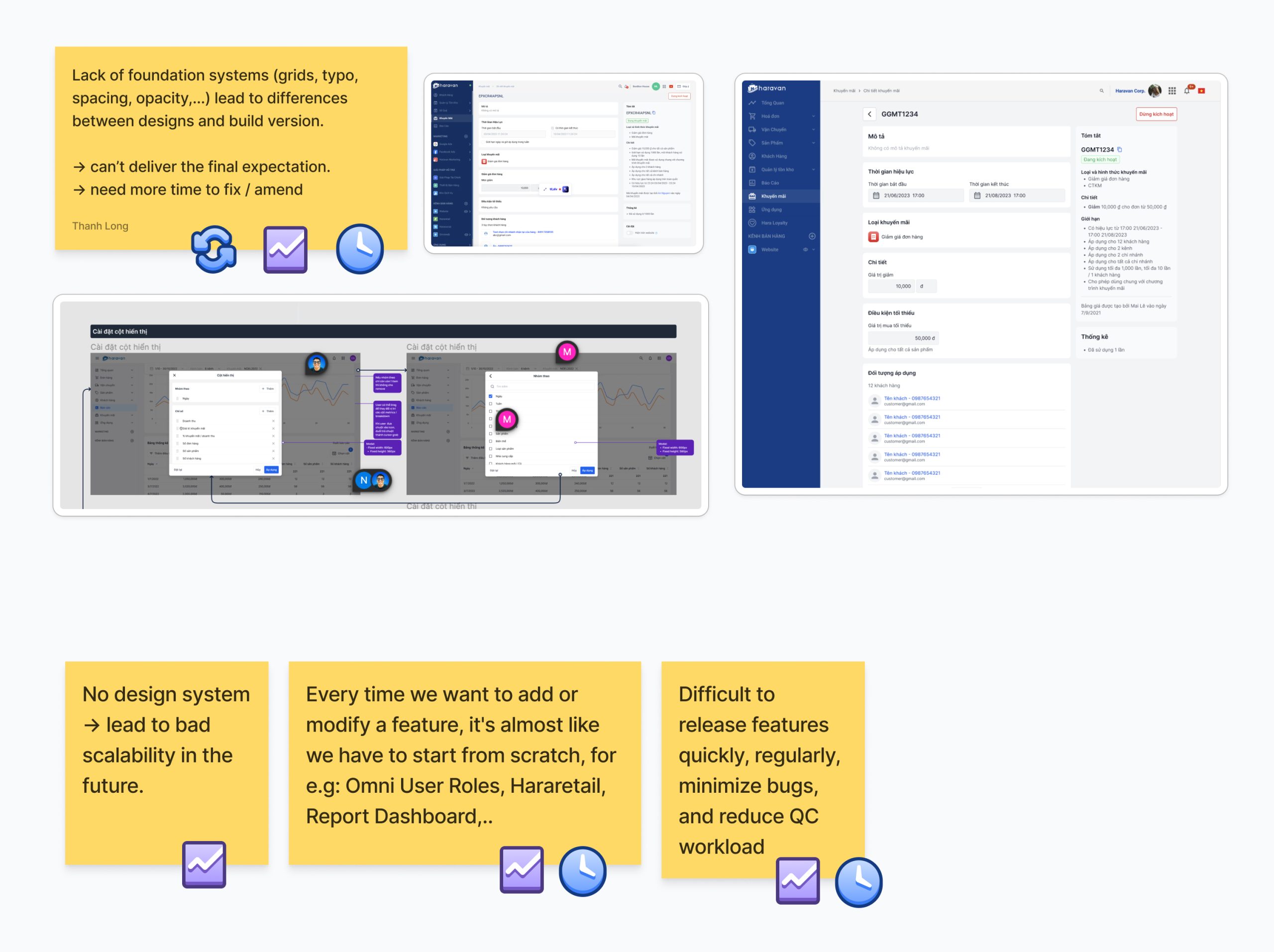
We observed and gathered feedback from cross-functional teams: Product Owners, Designers, Front-end Devs, QC. Most of the problems can be grouped into:
![]() Low individual productivity
Low individual productivity
Reducing work efficiency. Need to cross-check multiple teams.
![]() Bad collaboration
Bad collaboration
Lots of inconsistency. Double effort is seen everywhere.
![]() Wrong time commitment
Wrong time commitment
Incorrect time estimation due to expanded workload.
End-users' problems
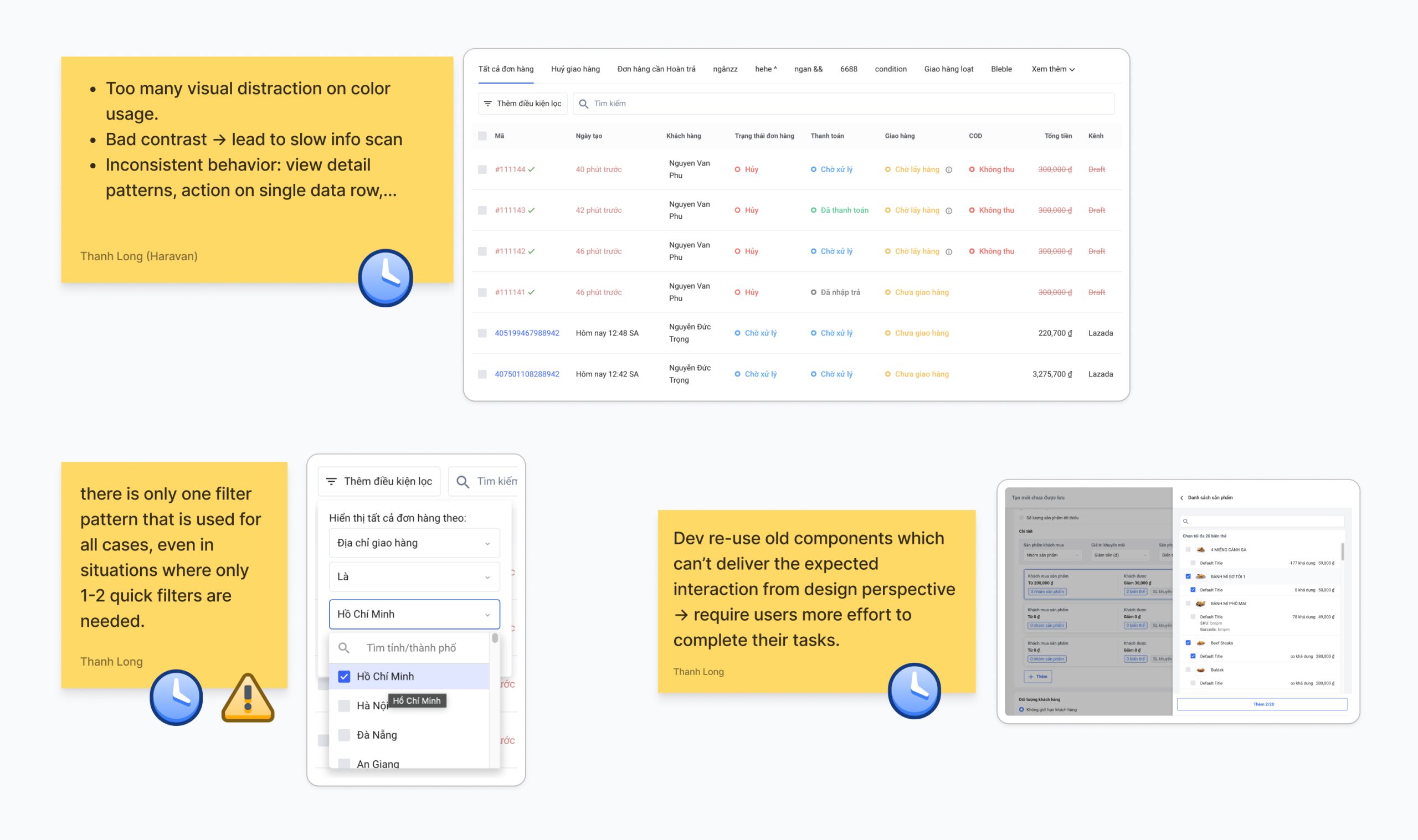
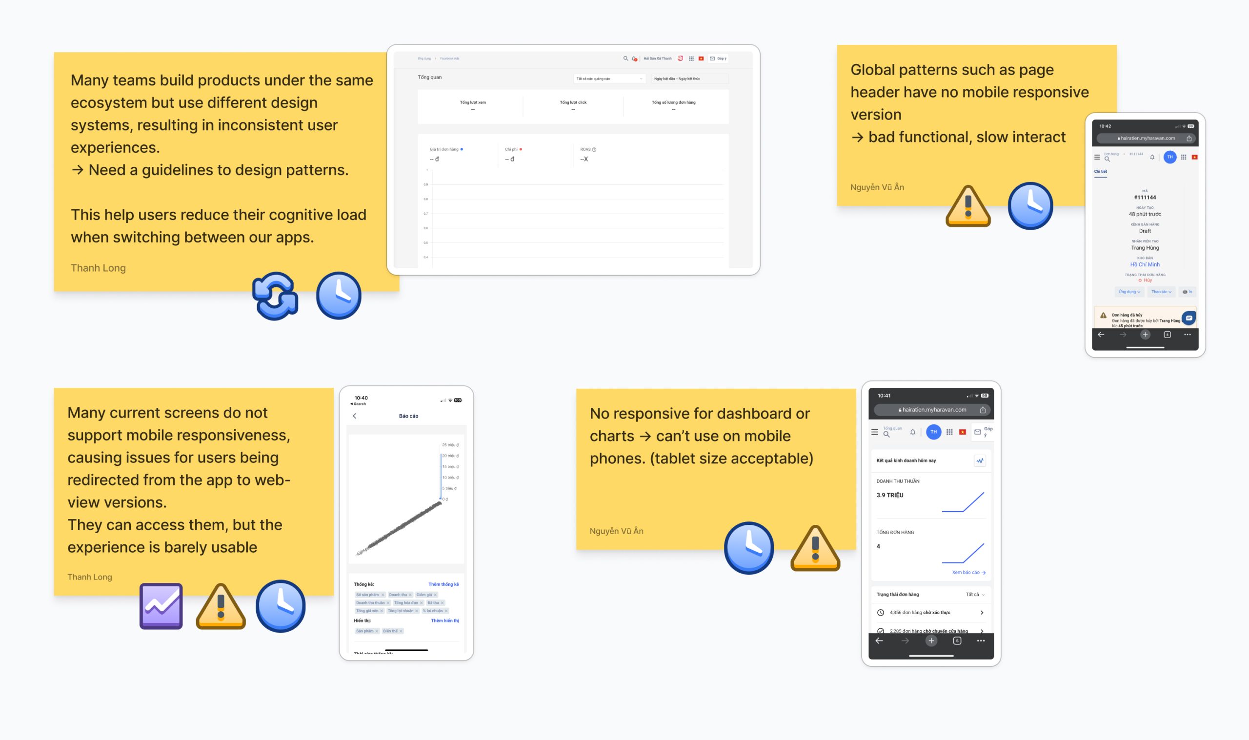
End-users are sellers who purchase the product to use for their sale activities. We conducted heuristic evaluation within design teams to uncover opportunities that can be solved:
![]() Functional problems
Functional problems
Bad responsive for mobile devices.
![]() Efficiency problems
Efficiency problems
Require huge effort to complete tasks, and causing cognitive load.
Solution: atomic design system and design tokens
These methodologies of building DS provide the answers that we need:
- Scalability for multiple product lines
- Consistency being maintained across teams
- Synchronized and centralized asset management
(I wrote a Medium article from what I researched 👇🏼)
💡 Make sure others understand the value of design tokens too.
Expertise sharing sessions are a great way to make sure your team is on the same page.
Form-up the design language
Design language, or visual language, is like any other languages. The words of visual language can be grouped into colors, spaces, shapes, typography and movement.
Design Inception Worksheet
Design Principles
To bring an intuitive experience for Haravan users, design principles are applied to ensure consistency in the design direction and development of the product.
Content Principles

Being a content-designer
Design the voice, tone, and visuals that work together to create a unified experience.
Being direct
Use clear, direct language. Users should know with certainty what an action will lead to.
Being less
Sometimes the best copy is no copy at all.
Being consistent yet understandable
Stick to rules can sometimes lead to confusing copy. When faced with choices, prioritize clarity.
Being human
Use copy that sounds like you're talking to your colleagues or friends.
💡 Keep in mind that there's no right or wrong way of naming tokens. Sit with your team and explore a way that work for your system.
Define the foundations
After establishing the token naming convention, we proceed to define the foundational styles of the system, encompassing elements such as colors, opacity, typography, layouts, radius, icons, shadow effects, grids, spacing, and more.
Craft components, templates, and beyond...
⏶ apply the new design system to Hararetail POS (beta ver)
Design system's adoption and contribution
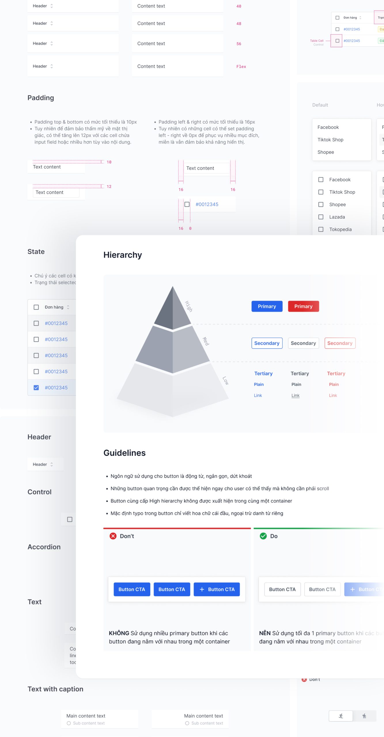
Design guidelines to boost confidence of use
In our design guidelines we show the specifications, properties, the behaviors, as well as dos and don'ts for designers and developers.
Immerse design system in team's workflow
Remove the tool friction
Designers - FE Dev will communicate mostly via Figma files when we hand-off design system. Therefore we create tutorial documents to remove any tool friction.
Keep it up to date
Our design system has component lifecycle where each component living its own stages. Outdated or useless components will step down and replaced by new ones.
💡 We named it 'Wheel'

The design system should be streamlined and built upon proven practices, saving us from reinventing the Wheel. We're all on the same car, and these Wheels propel the team towards our goals with minimal effort.
🚧 PRESENTATION UPDATING 🚧
Full version coming soon!


